
When you post an awareness poster in a hallway or a cafeteria, you have about three seconds to capture the attention of a hurried colleague. The rest of the time, the visual becomes part of the decor. The difference between a poster that has an impact and one that ends up ignored comes down to a few concrete choices in layout, tone, and format. Here are ten approaches tested in the field, each tailored to a specific objective.
These examples of awareness posters can be found in very different contexts, from health prevention in the workplace to construction site safety. The idea here is not to rank them from most beautiful to least beautiful, but to show what works depending on the message being conveyed.
Related reading : 10 Inspiring Tips for Successfully Designing Your Rooftop Terrace
1. The single-message poster on a solid background

In an industrial site, information-overloaded panels are common. The result: no one reads them. One idea per poster, not two. This is the foundation, and yet the majority of internal materials pile up instructions, logos, and contact information.
You may also like : How long does it take to temporarily increase the limit of your card at La Banque Postale?
The principle: a bold color background (yellow, red, dark blue), a phrase of fewer than ten words, zero unnecessary illustrations. It is used for reminders about barrier gestures, wearing PPE, or the prohibition of smoking. The message is read in passing, without stopping.
2. The poster with a Z-reading path
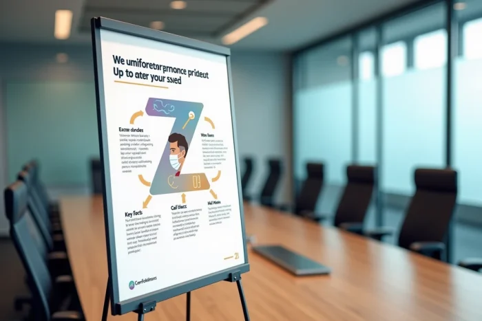
Good practices in graphic design recommend structuring the visual according to a Z-path: the gaze enters from the upper left corner, crosses to the right, descends diagonally, then sweeps across the bottom. Placing the title at the top left, the central image in the middle, and the expected action at the bottom right follows this natural trajectory.
This format is suitable for posters that need to both inform and guide towards an action (scanning a QR code, calling a number, attending a workshop). It enhances readability without adding arrows or numbers.
3. The emotional poster centered on a face
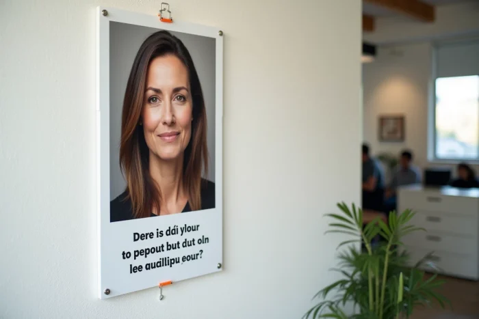
A human face captures attention faster than any pictogram. Road safety or anti-bullying campaigns have been exploiting this mechanism for a long time. The gaze of the photographed subject, directed towards the reader, creates a direct connection.
Emotion alone is not enough: it must be paired with a short phrase that gives meaning. Playing on emotions without a call to action creates discomfort, not change. A good combo: face + positive action verb (“Talk about it”, “Report”, “Protect”).
4. The “do this” poster rather than “don’t do that”
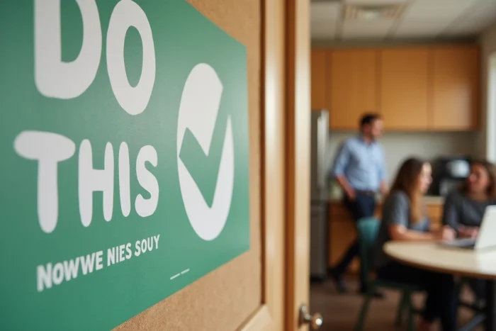
Framing the message positively changes the reception. “Wash your hands after each handling” works better than “Don’t touch your face with dirty hands.” The brain retains the suggested action, not the negation.
In the context of chemical risk prevention or food safety, this approach reduces the saturation effect. Teams exposed to dozens of prohibitions eventually ignore them all. Saying what to do provides a clear reference.
5. The infographic poster with internal numerical data

Rather than using national statistics that no one relates to their daily lives, some companies display their own data: number of days without accidents, volume of waste sorted the previous month, participation rate in awareness workshops.
Internal numbers create a much more powerful mirror effect than abstract data. The infographic format (bars, simple pie charts, icons) makes for quick reading. The poster is updated each month to maintain attention.
6. The poster with a QR code to extend the message

Paper support has its limits: you can’t explain everything in a few words. Adding a QR code that links to a short video, a quiz, or a practical sheet transforms the poster into an entry point for a broader awareness journey.
This phygital format responds to an underlying trend: designing the poster from the start for multi-support use (wall, intranet, dynamic screen, social media). Feedback varies on this point, but organizations that measure the scan rate generally observe a spike in usage during the first week, followed by a drop. Renewing the content linked to the QR code prolongs interest.
7. The humorous or quirky poster

The corporate tone can be tiresome. A poster that makes people smile is more likely to be shared and commented on among colleagues. Awareness campaigns on sorting, cybersecurity, or office posture lend themselves well to humor.
The limit: humor should not dilute the seriousness of the subject. For the prevention of psychosocial risks or serious accidents, it is better to remain sober. The quirkiness works on everyday themes, not on those that involve lives.
8. The seasonal thematic poster

Displaying a visual about heat-related risks in the middle of winter is a waste of space. Seasonal posters (heatwave in summer, ice in winter, allergies in spring) gain relevance because they arrive at the right time.
You can plan an annual rotation calendar for posters, aligned with health and safety themes at work. This also avoids the “wallpaper” effect of visuals that remain pinned for months without being changed.
9. The participatory poster created by employees

Organizing a workshop where teams design the poster themselves produces two effects. First, the message aligns with the actual vocabulary of the field. Second, employees take ownership of a visual they helped create.
This format requires some framing: providing a template, an imposed theme, and readability constraints. Without this, you end up with unreadable visuals. With minimal support, the results are often more impactful than posters purchased from a catalog.
10. The poster with an integrated success indicator
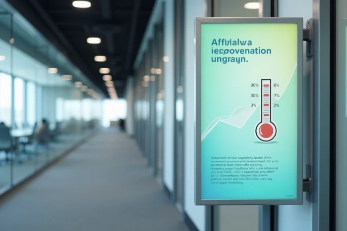
Recent awareness approaches integrate success indicators directly onto the support: a counter of days without incidents, a thermometer of progress towards a collective goal, a percentage updated by hand each week.
This type of poster transforms a static message into a living tracking tool. The need to update the figure compels someone to take care of it, keeping the subject visible within the organization.
- Define the indicator before designing the visual (number of incidents, sorting rate, participation in training)
- Provide a modifiable location on the poster (erasable area, repositionable insert)
- Designate a person responsible for the weekly update to prevent the counter from freezing
The most effective awareness poster is not the most beautiful; it is the one that has been designed for a specific context, an identified audience, and a measurable objective. Before launching the design, it is worthwhile to ask three questions: who will see it, in what environment, and what concrete behavior is expected in return.